The start of a new year has a natural reset energy — and for many Portland and Vancouver homeowners, that reset starts with looking around the house and deciding what finally needs to change. Interior paint is one of the fastest and most affordable ways to act on that impulse. A single room can be transformed in a weekend. A whole home can feel entirely different in a week.
2026 is bringing a set of interior paint directions that feel both fresh and grounded — less about chasing a single dominant trend and more about giving homeowners permission to use color with intention and confidence. The Pacific Northwest design sensibility, which has always leaned toward natural materials, layered textures, and colors rooted in the landscape, aligns particularly well with where interior paint is heading this year.
This post covers the interior paint trends that are worth paying attention to in 2026 — what they look like, why they work in Portland and Vancouver homes, and how to approach them if you’re ready to make a change in the new year.
Trend 1: Warm Earth Tones Move to the Walls
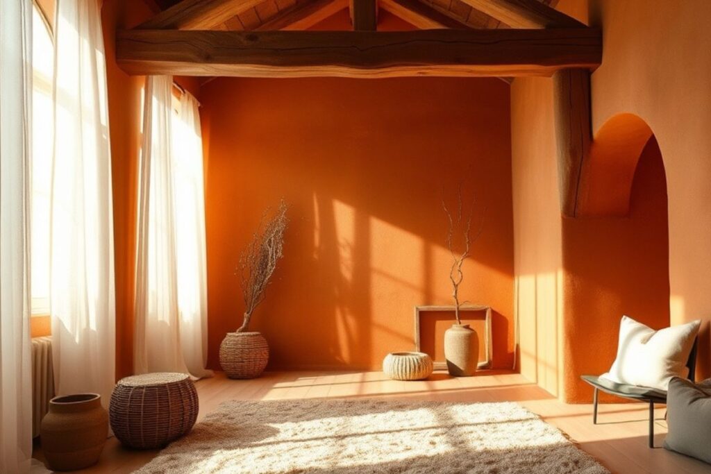
The cool gray and greige palette that dominated interior design for the better part of a decade is giving way to something warmer and more grounded. Terracotta, warm clay, dusty ochre, and muted rust tones are moving from accent pieces and textiles onto walls — and the shift feels significant in the best way.
These colors have an inherent warmth that performs particularly well in Pacific Northwest interiors, where overcast winter light can make cooler palettes feel flat or cold for months at a stretch. A warm clay wall in a Portland living room under lamplight in January creates a completely different atmosphere than the same room in a cool gray — it reads as enveloping and intentional rather than waiting for sunlight that isn’t coming.
The key to making earth tones work on walls is committing to the warmth rather than pulling back to something neutral. Half-measures in this palette — going with a beige that has just a hint of terracotta — tend to look indecisive. Shades like Sherwin-Williams Cavern Clay, Benjamin Moore Pueblo, and Farrow and Ball Red Earth deliver the warmth fully and look better for it.
Earth tones work best paired with natural materials — linen textiles, wood furniture, stone or ceramic accessories — that echo the color palette’s connection to the landscape. In Pacific Northwest homes where natural wood, exposed brick, and woven textures already feature prominently, warm earth wall colors feel like a natural evolution rather than a departure.
Trend 2: Deep, Saturated Blues and Blue-Greens
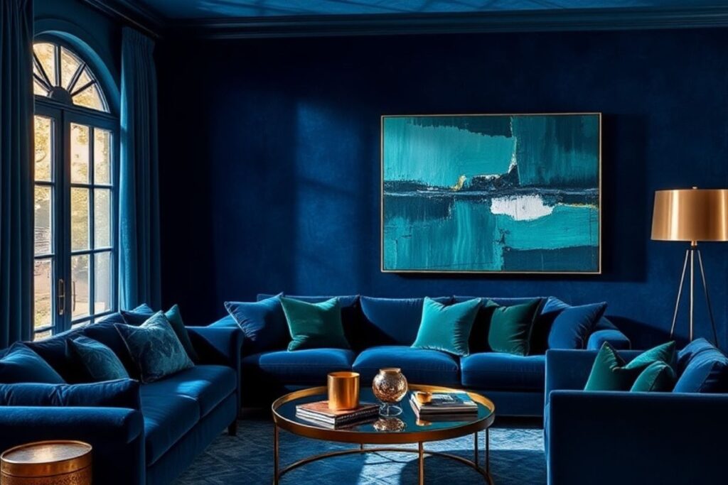
Deep blue has been building as an interior color story for several years, and 2026 is the year it moves fully into mainstream residential interiors. Navy, slate, deep teal, and blue-green shades that were once considered bold statement colors are being used across full rooms — not just as accent walls — and the results are consistently striking.
In the Pacific Northwest context, deep blues and blue-greens carry a specific resonance. They echo the color of the Willamette River at dusk, the winter sky over the Columbia Gorge, and the deep tones of Douglas fir in low light. These aren’t colors imported from a different design tradition — they feel native to the region.
Sherwin-Williams Naval, Benjamin Moore Van Deusen Blue, and Farrow and Ball Hague Blue are all strong choices for deep blue interiors. They work across room types — a deep blue living room anchored by warm brass lighting feels completely different from a deep blue bedroom with white linen, but both are compelling. The common thread is that the color does the design work, which means the room needs less layering to feel complete.
Deep blues and blue-greens work particularly well in rooms with limited natural light, which describes a significant number of Portland and Vancouver home interiors during winter. Counterintuitively, a dark color in a naturally dim room often feels more intentional and comfortable than a lighter color that’s simply failing to brighten the space.
Trend 3: Warm White Replaces Cool White Everywhere
If there’s a single color correction happening across Portland and Vancouver homes in 2026, it’s the shift from cool, blue-undertoned whites to warm, creamy off-whites. The bright cool whites that were installed in kitchens, bathrooms, and living rooms throughout the last decade are aging in a way that reads as stark and clinical rather than clean and fresh — particularly under the diffused light of a PNW winter.
Warm whites — shades with yellow, pink, or gray undertones that add depth without obvious color — are replacing them. Benjamin Moore White Dove, Sherwin-Williams Alabaster, Farrow and Ball Wimborne White, and similar off-whites have consistently been among the most requested interior colors for several years, and their dominance is only increasing in 2026.
The practical advantage of warm whites for Pacific Northwest homeowners is how they perform under artificial light. A cool white that looks clean and bright under natural daylight takes on a slightly bluish or greenish cast under incandescent and LED warm light in the evening — the times when most homeowners actually spend time in their spaces. A warm white, by contrast, shifts toward a richer, creamier tone under artificial light that feels genuinely comfortable rather than clinical.
For homeowners considering a whole-home refresh, coordinating warm whites across living areas while using more saturated colors in specific rooms is one of the most effective approaches to a cohesive interior paint scheme. The post on interior painting ideas for Portland homes this fall covers room-by-room color strategy in more detail.
Trend 4: Painted Ceilings Get Serious
2026 is the year more Portland and Vancouver homeowners discover what designers have been doing for years: treating the ceiling as a design surface rather than a blank white afterthought. Painted ceilings — whether matched to the wall color, used as a contrasting accent, or treated with a deep, unexpected shade — are one of the most impactful and underused interior paint moves available.
The approach that’s gaining the most traction is the tonal ceiling — painting the ceiling the same color as the walls but one or two shades lighter or darker. This creates a wrapped, immersive effect that makes a room feel deliberately designed from every angle. In a deep blue living room, a ceiling in a slightly lighter version of the same blue creates a depth that a white ceiling simply can’t achieve.
The contrasting ceiling approach — a colored ceiling in a room with white or neutral walls — works particularly well in rooms with strong architectural detail. Portland craftsman homes with coffered ceilings, beamed living rooms, or defined ceiling planes are excellent candidates for a ceiling color that draws the eye up and frames the architecture.
Even a simple change from stark white to a warm off-white or soft gray on the ceiling changes the energy of a room in a way that’s hard to articulate but immediately felt. It’s one of the highest-impact, lowest-cost adjustments available in an interior paint project, and it’s becoming a standard recommendation rather than an advanced move.
Trend 5: Color Drenching — One Color, Every Surface
Color drenching is the practice of painting a room in a single color across all surfaces — walls, ceiling, trim, and sometimes even doors — to create a fully immersive color environment. It sounds like it should be overwhelming, and in the wrong hands it can be. Done thoughtfully, it’s one of the most sophisticated and effective interior paint approaches of the decade.
The reason color drenching works is that it eliminates the visual interruption of contrasting trim. When walls, baseboards, door casings, and ceiling are all the same color, the eye reads the room as a continuous surface rather than a collection of painted elements. The architecture recedes and the space itself becomes the experience.
Deep, moody colors — dusty sage, warm charcoal, soft terracotta, faded navy — work best for color drenching because they have enough depth to carry the weight of all-over application without feeling flat. Lighter colors can also work, particularly in smaller spaces like powder rooms, home offices, or reading nooks, where the wrapped effect feels cozy rather than heavy.
For Pacific Northwest homes with the craftsman trim detail, built-in bookshelves, and panel wainscoting common in Portland’s residential stock, color drenching in a rich earth tone or deep green highlights the architecture rather than competing with it. The trim detail that might read as busy in a multi-color scheme becomes a series of subtle planes in the same color — present but not dominant.
Trend 6: Biophilic Greens Deepen and Diversify
Green has been the defining interior color story of the early 2020s, and 2026 sees the palette maturing rather than fading. The soft sage that led the green wave is still going strong, but it’s being joined by deeper, more complex green shades — hunter green, dark olive, forest tones, and bottle green — that bring more presence and intensity to interior spaces.
In the Pacific Northwest, green interiors feel like a natural extension of the landscape rather than a trend import. The same Douglas firs, moss-covered stone, and rain-soaked hillsides that define the visual environment outside Portland and Vancouver make green walls inside feel connected and grounded rather than decorative.
The 2026 direction is toward greens with gray, brown, or blue undertones rather than the yellow-green shades that can read as acidic under artificial light. Farrow and Ball Calke Green, Benjamin Moore Backwoods, and Sherwin-Williams Rookwood Dark Green are the kinds of shades gaining traction — complex, deep, and characterful in a way that purely saturated greens are not.
Green works across every room type in 2026. A dark green home office creates a focused, contained feeling that homeowners working from home in Portland find genuinely productive. A sage green bedroom is consistently rated as one of the most calming color environments for sleep. A deep olive kitchen ties to the natural material palette of wood, stone, and ceramic in a way that few other colors can.
Trend 7: Bold Color in Unexpected Rooms
One of the most freeing interior paint shifts of 2026 is the growing acceptance of bold color in rooms that have traditionally been treated as purely functional. Laundry rooms, mudrooms, home offices, and powder rooms are being treated as opportunities for color expression rather than afterthoughts painted in whatever leftover neutral was on hand.
The logic is straightforward — smaller, more contained spaces can carry bold colors that might feel overwhelming in a large open living area. A powder room in a deep terracotta or rich midnight blue is a moment of surprise and delight for guests; the same color in a 400 square foot living room might be harder to commit to. Utility spaces like mudrooms and laundry rooms, which homeowners typically pass through rather than spend extended time in, are ideal for bold color experiments that don’t require the same level of long-term commitment.
For Portland and Vancouver homes, the practical benefit of treating these spaces thoughtfully extends to how the overall home feels. A mudroom that transitions from the gray Oregon winter into a warm, intentional color sets a different tone for entering the home than one that’s painted the same beige as the hallway. Small color investments in unexpected places often do more for how a home feels than larger investments in obvious ones.
Making 2026 Trends Work in a Pacific Northwest Home
The through-line across all of these 2026 interior paint directions is intention. The trend is away from safe, non-committal palettes and toward color choices that are made with purpose — whether that’s a deeply considered earth tone, a fully drenched accent room, or a painted ceiling that finally treats the fifth wall like it matters.
For Portland and Vancouver homeowners, the regional context adds a useful filter. Colors that perform under diffused PNW light, that connect to the landscape rather than fighting it, and that feel comfortable under lamplight through six months of rain are the ones worth pursuing. The warm earth tones, deep blues, complex greens, and warm whites that define 2026’s interior paint story all check those boxes.
GB Painting works with homeowners across Portland, Vancouver, Lake Oswego, and Gresham to bring these color directions to life — from single-room refreshes to whole-home repaints. The team brings color consultation into every project, helping clients navigate the selection process with confidence before a brush touches the wall. To start a new year with a home that actually reflects how you want to live in it, reach out through the contact page to schedule a free estimate and color consultation.
Browse completed interior projects in the portfolio and explore the full range of interior painting services available for homes throughout the Pacific Northwest.
GB Painting LLC provides professional interior painting services across Portland OR, Vancouver WA, Lake Oswego, and the Pacific Northwest. Call (503) 863-1557 or request a free estimate to start your 2026 refresh.