Fall in Portland changes the relationship between a home and the people living in it. The long outdoor evenings of summer give way to earlier sunsets, more time spent inside, and a natural shift toward wanting the interior to feel as comfortable and considered as the season itself. It’s one of the most motivated times of year for homeowners to look around and decide that the living room needs a refresh, the bedroom has felt tired for too long, or the hallway color that made sense five years ago simply doesn’t anymore.
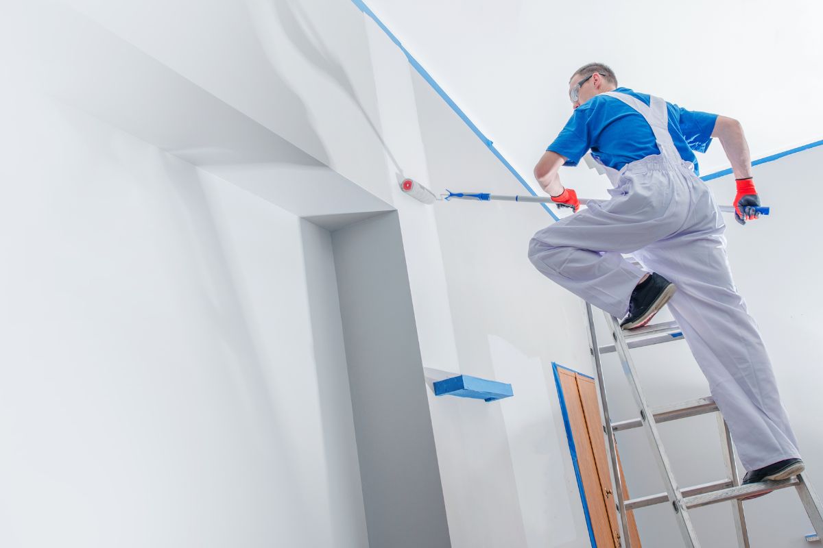
Interior painting is also one of the highest-impact, most cost-effective ways to change how a space feels. The right color in the right room can make a low-ceilinged space feel taller, a large open room feel more grounded, and a dark corner feel warmer and more inviting. Fall is an ideal time for the project — windows can be cracked for ventilation even as temperatures cool, natural light is still sufficient for accurate color evaluation, and the timing lines up with the instinct to settle into home for the season.
This guide covers interior painting ideas across every major room in a Portland home, with color direction suited to the Pacific Northwest light conditions and design sensibilities that define the region.
Why Fall Is the Right Time for Interior Painting in Portland
Interior painting doesn’t have the same seasonal constraints as exterior work — you’re not waiting for dry weather or minimum temperature thresholds for paint to cure. But fall has practical advantages that make it a particularly good time for interior projects in Portland.
Ventilation is easier in fall than in deep winter. Fresh paint requires airflow to off-gas properly, and cracking windows in October is comfortable in a way that opening them in January is not. Portland’s fall temperatures — typically ranging from the mid-40s overnight to the mid-60s during the day — are ideal for keeping rooms ventilated without creating uncomfortable working conditions.
Fall also tends to be a slower scheduling period for painting contractors after the busy summer exterior season. Homeowners who want professional interior painting done before the holidays typically find better availability and faster project turnaround in October and November than they would in June or July.
And there’s the simple motivation factor. Walking into a freshly painted living room as the leaves turn and the evenings get earlier feels different than the same project completed in August. Fall interior painting has a way of making a home feel ready for the season.
Living Room: Setting the Tone for the Whole Home
The living room carries more visual weight than any other space in most Portland homes. It’s where guests form their first impression of the interior, where the family spends the most collective time, and where the paint color is visible from the most angles and under the widest range of light conditions — natural morning light, overcast afternoon light, and artificial evening light all in the same day.
Warm Neutrals and Earthy Tones
Warm neutrals — creamy whites, soft taupes, warm greiges — are reliably strong choices for Portland living rooms because they perform consistently under the diffused PNW light that dominates for much of the fall and winter. They don’t shift dramatically between overcast afternoon light and lamplight in the evening, which makes the room feel stable and cohesive across the full day.
Benjamin Moore White Dove, Sherwin-Williams Accessible Beige, and Farrow and Ball Elephant’s Breath are all consistently popular choices in Portland homes. These colors read as sophisticated without being cold, and they work as a backdrop for the layered textiles, natural wood, and mixed materials that characterize Pacific Northwest interior design.
Deep, Moody Tones for Accent Walls
Fall is the season when deeper, richer interior colors feel most at home, and Portland’s design sensibility leans naturally toward earthy, saturated shades. A single accent wall in a deep forest green, warm terracotta, or rich burgundy can completely reframe how a living room feels without requiring the full commitment of painting every wall in a bold color.
Sherwin-Williams Rookwood Amber, Benjamin Moore Newburyport Blue, and Farrow and Ball Green Smoke are shades that work particularly well as accent walls in Portland living rooms — they’re saturated enough to make a statement but grounded enough to feel intentional rather than overwhelming.
Bedroom: Building Toward Rest
Bedroom color choices operate on different criteria than living rooms. The goal isn’t to impress or energize — it’s to create an environment that supports winding down and sleeping well. Research on color and sleep quality consistently points toward cooler, lower-saturation shades as better performers in sleeping environments, and this aligns with what most Portland homeowners report from experience.
Soft Blues and Blue-Greens
Soft blue and blue-green shades are among the most consistently recommended bedroom colors because they register as calm without being cold. Under the warm artificial light of bedside lamps in the evening, these colors shift toward a grayer, more neutral tone that’s easy to relax in. During the day under Portland’s overcast light, they read as quiet and restful.
Benjamin Moore Buxton Blue, Sherwin-Williams Watery, and Behr Dusty Miller are shades that hit this balance well. They’re distinctive enough to feel considered but subtle enough that they never feel like they’re competing for attention in a space meant for rest.
Warm Off-White for Small Bedrooms
In smaller Portland bedrooms — common in the craftsman bungalows and older homes that make up much of the city’s residential stock — a warm off-white keeps the space feeling open without the clinical coldness of a bright stark white. Benjamin Moore White Dove and Sherwin-Williams Alabaster both add warmth that reads beautifully under soft bedroom lighting while keeping the room feeling as spacious as possible.
Kitchen: Functional and Fresh
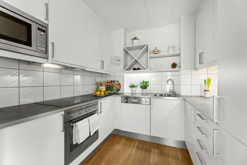
Kitchen painting decisions involve practical considerations that don’t apply elsewhere in the home. Kitchens are high-moisture, high-traffic spaces where walls take more abuse than in other rooms — cooking steam, splashes, fingerprints, and frequent cleaning all put the paint finish through regular stress. Finish selection matters as much as color in kitchen applications.
Satin and semi-gloss finishes are the standard recommendation for kitchen walls because they’re cleanable without being so shiny that every brush mark and imperfection shows. Semi-gloss on trim and cabinets holds up particularly well to the cleaning frequency that kitchen surfaces require.
Light and Airy Whites
A bright, clean kitchen feels more welcoming in a Portland fall than a dark one, and white or near-white walls remain one of the most effective ways to keep a kitchen feeling open and functional. Paired with natural wood shelving, matte black hardware, or warm tile, white kitchen walls create the kind of contrast that makes a kitchen feel put-together without trying too hard.
Sage Green and Warm Yellow-Green
Sage green has moved from trend to staple in Pacific Northwest kitchens over the past several years, and it continues to perform because it connects the interior to the natural landscape outside. In a Portland kitchen where a window looks out onto a garden or a tree-lined street, sage walls create a visual conversation with the exterior that feels natural and considered.
If the kitchen has painted cabinets that need refreshing rather than just the walls, the post on how to pick the perfect cabinet paint color for your kitchen covers the full selection process — coordinating wall and cabinet colors, finish choices, and hardware combinations that work in Pacific Northwest kitchen environments.
Home Office: Supporting Focus Without Draining Energy
The home office became a central room in Portland homes in recent years, and painting decisions for work spaces have their own logic. The goal is a color environment that supports concentration and doesn’t become visually fatiguing over long working hours — while still feeling like a considered, pleasant space rather than a blank corporate box.
Warm whites and soft greens consistently outperform cool grays in home office settings. Gray offices can feel oppressive under extended artificial lighting, particularly in a Portland fall and winter when natural light is limited. A warm white like Sherwin-Williams Alabaster keeps the room bright and clean without fatigue. A soft sage or muted olive adds enough color interest to prevent the space from feeling sterile.
For home offices with built-in shelving, a two-tone approach — lighter walls with a deeper, richer color on the built-in unit — creates visual depth and makes the bookcase or shelving unit feel like a considered design element rather than a functional afterthought.
Hallways and Entryways: First and Last Impressions
Hallways and entryways are the most underinvested spaces in most Portland homes, and they’re also the spaces that benefit most dramatically from a well-chosen paint color. Because they’re transitional spaces without furniture to anchor them, the wall color carries the full visual weight of the area.
Deep, rich colors work particularly well in hallways and entryways because the limited square footage prevents them from feeling overwhelming in the way they might in a larger room. A dark navy, deep forest green, or rich terracotta entryway creates a confident, intentional first impression and makes the rest of the home feel more expansive by contrast.
For longer hallways where dark colors might make the space feel tunnel-like, a warm medium tone — dusty rose, warm clay, or a soft brick red — adds personality without the compression that very deep shades create.
Ceilings: The Fifth Wall Most Homeowners Ignore
Ceiling color is one of the highest-impact, most overlooked opportunities in interior painting. Most ceilings in Portland homes are painted flat white by default, and most homeowners never question it. But ceiling color has a meaningful effect on how a room feels — in ways that often register emotionally before they’re consciously identified.
A ceiling painted the same color as the walls but one shade lighter creates a wrapped, cocoon-like effect that works beautifully in bedrooms and intimate spaces. A ceiling painted a soft blue-gray makes a room feel like it has more sky in it — appropriate for Portland homes where actual sky is in limited supply for much of the year. Even a ceiling painted in the same shade as a bold accent wall, carried up from the wall plane, creates a sophisticated, considered effect that reads as very intentional design.
Flat finish is the standard for ceilings because it hides imperfections that sheen would highlight, but eggshell on ceilings in kitchens and bathrooms makes them easier to clean in high-moisture environments.
Working With a Professional Painting Team
Interior painting projects range from a single accent wall to a complete whole-home repaint, and the right approach depends on scope, timing, and how much disruption fits into the household’s schedule. GB Painting handles interior projects of every scale across Portland, Vancouver, Lake Oswego, and Gresham — from a single room refresh to full multi-room repaints timed around a fall schedule. The interior painting services page covers what the process looks like and what to expect from start to finish.
The team brings color consultation into the process from the beginning — helping homeowners narrow down choices, evaluate how specific shades will read in their actual light conditions, and coordinate colors across rooms so the whole home feels cohesive rather than a collection of disconnected decisions.
For Portland homeowners who want to use fall as the opportunity to finally address the rooms that have needed attention, getting a free estimate scheduled now means the work can be completed before the holiday season. Reach out through the contact page to set up a consultation, or browse completed interior projects in the portfolio to see what the results look like.
GB Painting LLC provides professional interior painting services across Portland OR, Vancouver WA, Lake Oswego, and the Pacific Northwest. Call (503) 863-1557 or request a free estimate today.