Cabinet color is one of the most consequential decisions in any kitchen refresh. Get it right and the whole space feels intentional, cohesive, and elevated. Get it wrong and even an otherwise well-designed kitchen can feel off — too dark, too cold, or simply out of place with everything around it.
The good news is that choosing the right cabinet paint color isn’t guesswork. It follows a logic that accounts for light conditions, existing finishes, room size, and the overall style of your home. Once you understand what drives a color to work or not work in a given kitchen, the decision becomes much clearer.
This guide walks through the full process — from reading your kitchen’s light to narrowing down palette options to understanding which colors are trending and which ones stand the test of time.
Start With the Light in Your Kitchen
Before you look at a single paint chip, spend some time observing how light moves through your kitchen at different times of day. Light is the single most important variable in how a cabinet color will read once it’s on the doors.
North-facing kitchens receive cool, indirect light for most of the day. In these spaces, colors with warm undertones — creamy whites, soft yellows, warm greiges — help offset the natural coolness and prevent the room from feeling flat or clinical. Cool-toned colors like stark white, gray-blue, or icy green can feel cold and unwelcoming in a north-facing kitchen.
South-facing kitchens get more direct sunlight, which warms everything up and gives you more flexibility. Cooler cabinet colors that might feel chilly in other orientations — crisp whites, soft grays, pale blues — look balanced and refreshing with southern light behind them.
East and west-facing kitchens shift throughout the day, moving from warm morning or evening light to cooler midday tones. In these spaces, mid-range neutrals that aren’t strongly warm or cool tend to perform most consistently across different times of day.
In the Pacific Northwest specifically, overcast conditions mean most kitchens operate under diffused, lower-contrast light for a significant portion of the year. This is important context for Vancouver and Portland homeowners — colors that rely on direct sun to come alive can look dull and flat for months at a time. Choosing shades with inherent warmth or depth tends to work better than colors that depend on bright light to read well.
Consider Your Countertops, Flooring, and Hardware
Your cabinets don’t exist in isolation. The color you choose has to work alongside the countertop material and color, the flooring, the backsplash (if there is one), and the hardware finish. These fixed elements are your starting constraints, and the cabinet color needs to complement rather than compete with them.
With white or light gray countertops, you have the most flexibility. Almost any cabinet color — from deep navy to warm cream to sage green — can work, because the neutral countertop won’t fight back. The cabinet color becomes the defining decision for the room’s personality.
With warmer countertops — butcher block, honey-toned granite, warm beige quartz — cabinet colors with cool undertones can create a pleasing contrast, while warm-on-warm combinations require careful calibration to avoid the space feeling heavy or muddy.
Dark countertops like black granite or deep charcoal quartz pair naturally with lighter cabinets, where the contrast creates definition and prevents the kitchen from feeling closed-in. All-dark combinations can work in larger, well-lit kitchens but feel oppressive in smaller spaces.
Hardware finish matters more than people expect. Brass and gold hardware warms up cabinet colors and works best with creamy whites, greens, and warm grays. Brushed nickel and chrome read cleaner with cooler whites and grays. Matte black hardware is the most versatile — it grounds almost any cabinet color without pulling it in a warm or cool direction.
Cabinet Color Ideas That Work
Crisp White and Off-White
White cabinets remain the most popular choice for a reason. They make a kitchen feel larger and brighter, they work with virtually every countertop and flooring combination, and they’re unlikely to feel dated over time. The key is choosing the right white — one that works with your specific light conditions and undertone environment.
Pure bright whites like Chantilly Lace or Extra White work well in kitchens with strong natural light and cool countertops. Off-whites like Benjamin Moore White Dove, Sherwin-Williams Alabaster, or Benjamin Moore Simply White bring warmth that prevents the space from feeling clinical, and they perform better under PNW overcast conditions.
The GB Painting team helps clients navigate white selection during the consultation process — a step that’s built into every cabinet painting project because even small undertone differences can significantly change how a white reads on full cabinet faces.
Soft Gray
Gray cabinets had a long run as the dominant kitchen trend and remain a strong choice when selected thoughtfully. The challenge with gray is that it covers enormous range — from warm greige all the way to cool blue-gray — and the wrong shade in the wrong light can feel cold, dated, or dingy.
For Pacific Northwest kitchens, grays with warm undertones or a slight green cast tend to work better than pure cool grays. Sherwin-Williams Repose Gray, Benjamin Moore Stonington Gray, and similar warm-leaning shades have held up well over time. Avoid grays that pull strongly purple or blue in lower light conditions, as these undertones become more pronounced under overcast skies.
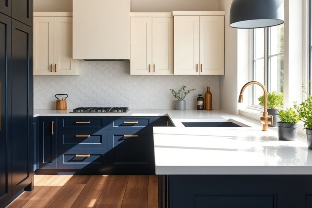
Navy and Deep Blue
Deep blue cabinets — particularly on lower cabinets or kitchen islands — have become one of the defining looks of contemporary Pacific Northwest kitchen design. Navy reads as rich and grounded without being as stark as black, and it works especially well with brass hardware and white or light countertops.
Sherwin-Williams Naval, Benjamin Moore Hale Navy, and Benjamin Moore Newburyport Blue are consistently strong choices. Deep blue works best when balanced with lighter upper cabinets or open shelving — all-navy kitchens can feel heavy unless the space has excellent natural light.
Sage Green and Muted Olive
Green cabinets are having a sustained moment, and in the Pacific Northwest context, it makes particular sense. Sage, muted olive, and earthy green shades feel connected to the surrounding landscape — they look at home in Vancouver and Portland in a way that feels organic rather than trendy.
Benjamin Moore Salamander, Sherwin-Williams Privilege Green, and Farrow and Ball Mizzle are popular choices that hold up well under PNW light. Green cabinets work beautifully with natural wood accents, stone countertops, and both brass and matte black hardware.
Warm Greige and Tan
For homeowners who want something warmer than gray but more neutral than a statement color, warm greige and tan cabinets offer a middle path that’s both timeless and approachable. These shades work particularly well in kitchens with a lot of natural wood — butcher block counters, hardwood floors, or open shelving — where the warmth in the cabinet color ties the elements together.
Sherwin-Williams Accessible Beige, Benjamin Moore Camouflage, and similar warm neutrals are solid choices for this look. They’re unlikely to feel dated, they photograph well, and they add warmth to kitchens that might otherwise feel cold.
Two-Tone Cabinets: Upper and Lower
One of the most practical and visually effective approaches for kitchens with a lot of cabinetry is the two-tone treatment — a lighter color on upper cabinets and a darker or more saturated color on lower cabinets or the island. This approach adds visual interest without overwhelming the space, and it allows you to incorporate a bolder color while keeping the overall feel balanced.
Common two-tone combinations include white uppers with navy lowers, cream uppers with sage green lowers, and light gray uppers with a warm charcoal island. The key is choosing colors that share an undertone family so they feel intentional rather than mismatched.
The GB Painting team regularly handles two-tone cabinet projects across Vancouver, Portland, and Lake Oswego. The cabinet painting service page covers what the full process looks like, including surface prep, priming, and finish selection for long-lasting results.
Finish Matters as Much as Color
The sheen level of your cabinet paint affects both the appearance and the durability of the finish. Kitchen cabinets are high-contact surfaces — they get touched, wiped down, and exposed to cooking moisture constantly — so finish selection is a practical decision as much as an aesthetic one.
Semi-gloss and satin finishes are the most practical for kitchen cabinets. They’re easier to clean, more resistant to moisture, and hold up better to daily wear than flat or eggshell finishes. Semi-gloss has a slightly higher sheen that emphasizes cabinet details but can also highlight surface imperfections, so prep quality matters significantly. Satin sits in the middle — durable and cleanable without being overly shiny.
Matte finishes have grown in popularity for a more contemporary, muted look, but they require more careful maintenance in a kitchen environment. Certain premium cabinet paints offer matte finishes with better durability than standard flat paint, which is worth discussing during the product selection phase.
Testing Before Committing
No matter how confident you are in a color choice, testing it on the actual cabinet surface before the full project begins is time well spent. Paint chips and digital renderings are useful for narrowing down options, but they can’t replicate how a color reads on a full cabinet face under your kitchen’s specific lighting conditions.
Sample patches — a painted panel or a few cabinet doors — let you see the color at different times of day, next to your countertops and flooring, and under both natural and artificial light. It’s the most reliable way to confirm a choice before the full commitment.
GB Painting’s color consultation process includes this kind of practical guidance from the start. For homeowners in Vancouver, Portland, Gresham, or Lake Oswego who are ready to move forward, reaching out through the contact page is the first step toward a free estimate and a color conversation with the team.
GB Painting LLC has completed cabinet painting projects across the Pacific Northwest since 2015. Browse finished kitchens and other projects in the portfolio, or explore the full range of interior painting services available for homes and commercial properties throughout the region.
GB Painting LLC offers professional cabinet painting services across Vancouver WA, Portland OR, Lake Oswego, and the Pacific Northwest. Call (503) 863-1557 or request a free estimate today.